
The problem
Small practices need sites that feel like their own, and they rarely have budget for a custom build each time. Their patients and clients also include older readers, people with low vision and people who are sensitive to motion. Accessibility usually arrives last, as a plugin, if it arrives at all.
So the system does both jobs at once. Brand lives in a small set of tokens that change from client to client. Accessibility lives in a settings layer that every site shares.
Foundations
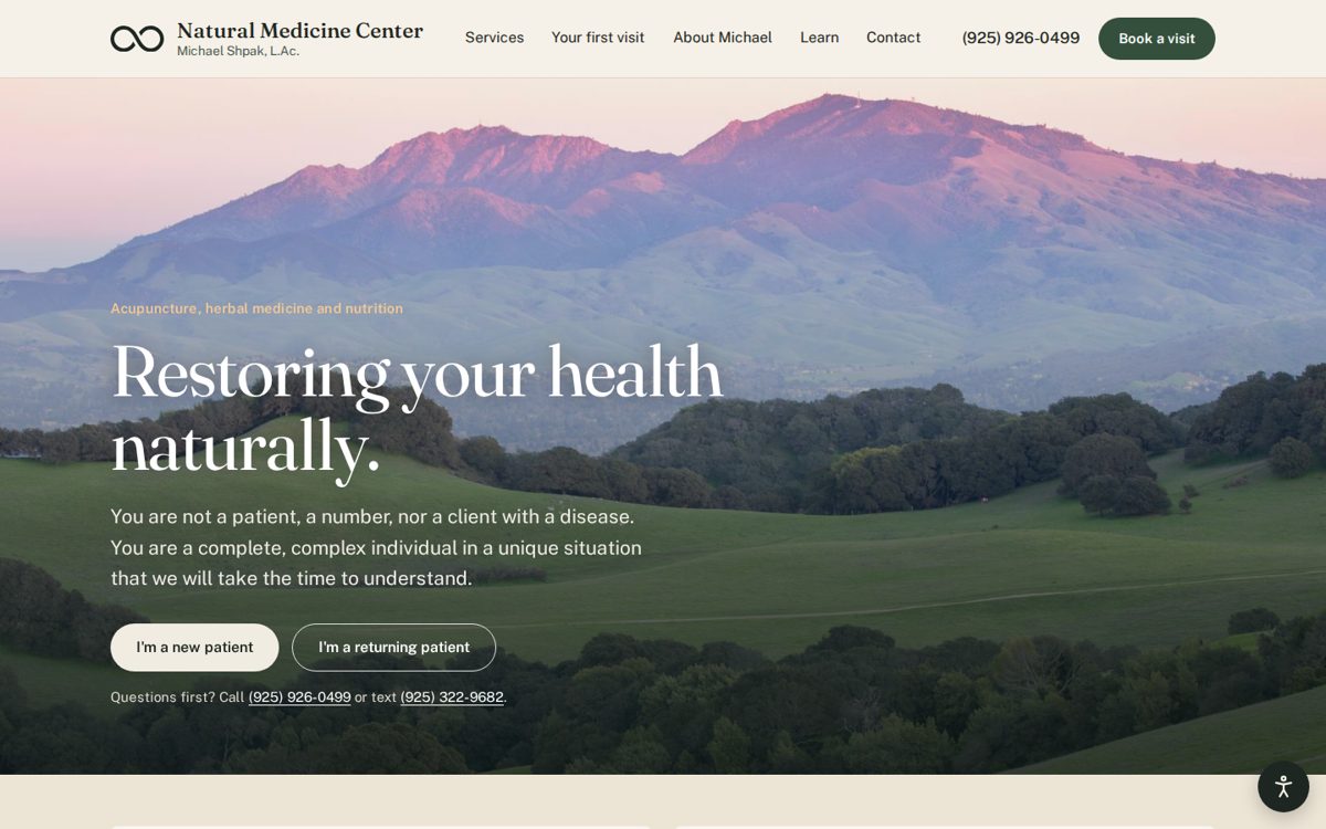
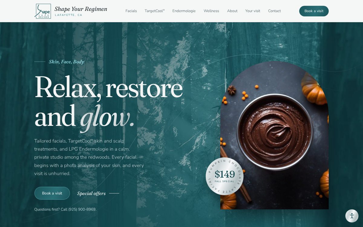
Every color in a component is a token with a job: a surface, a text color for that surface, a boundary for a control, or decoration. Text tokens are grouped by the surface they sit on, so the page band, the dark feature band, the footer and the photo hero each have their own set. Two type tokens carry the serif and the sans, which is what lets a single setting swap the typeface across the whole site.
A file of token metadata records what each token is for and which pairs have to meet which contrast ratio. People can read it, and so can Claude.
The settings layer
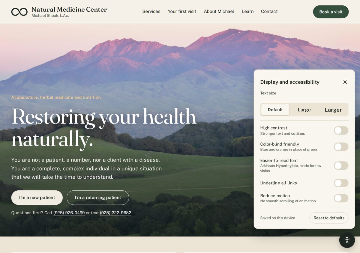
On Natural Medicine Center, a panel on every page lets visitors set the site to suit them, and the choice is saved on their device. There are six settings, and each one is a single attribute on the root element. The tokens and a few targeted rules do the rest.
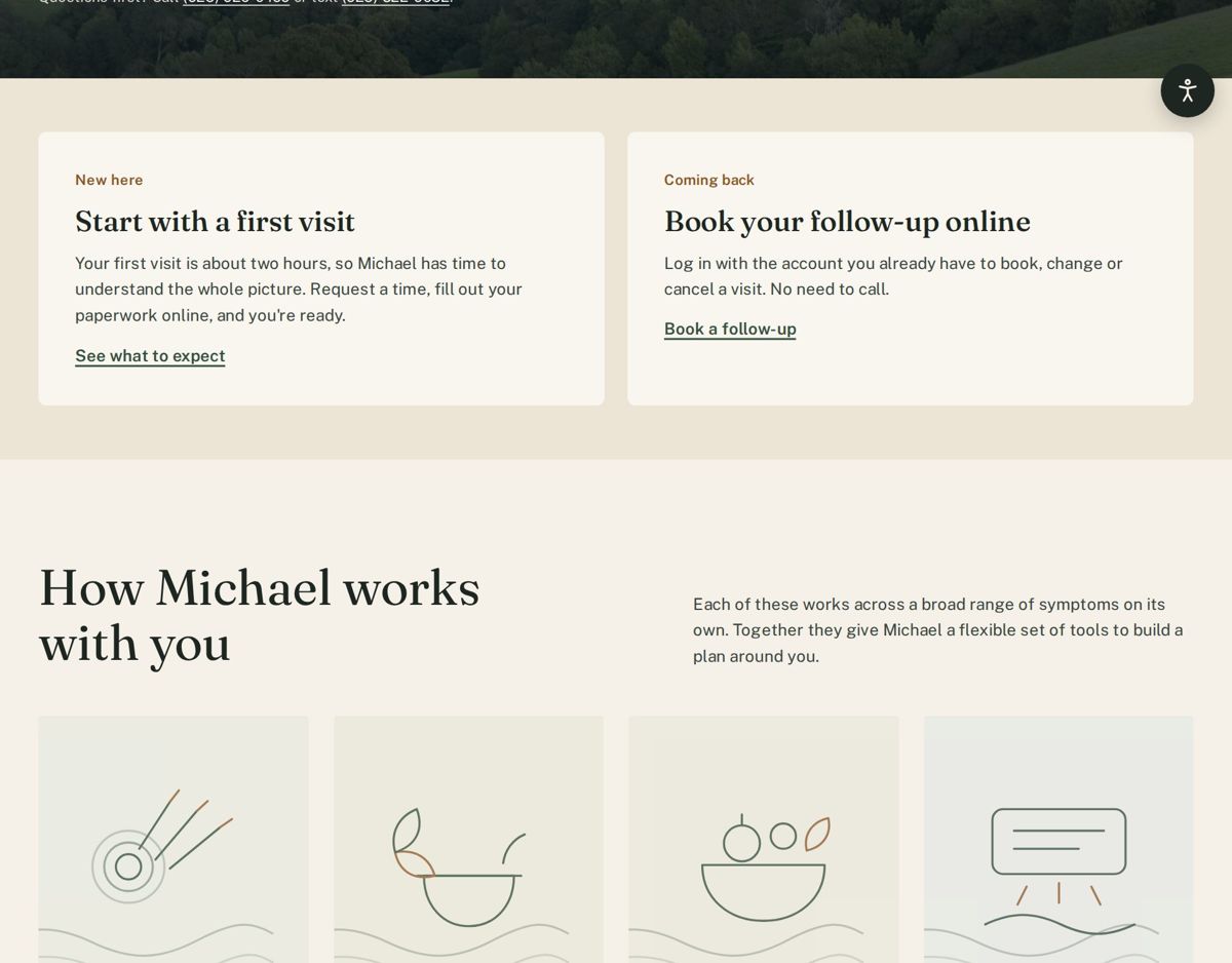
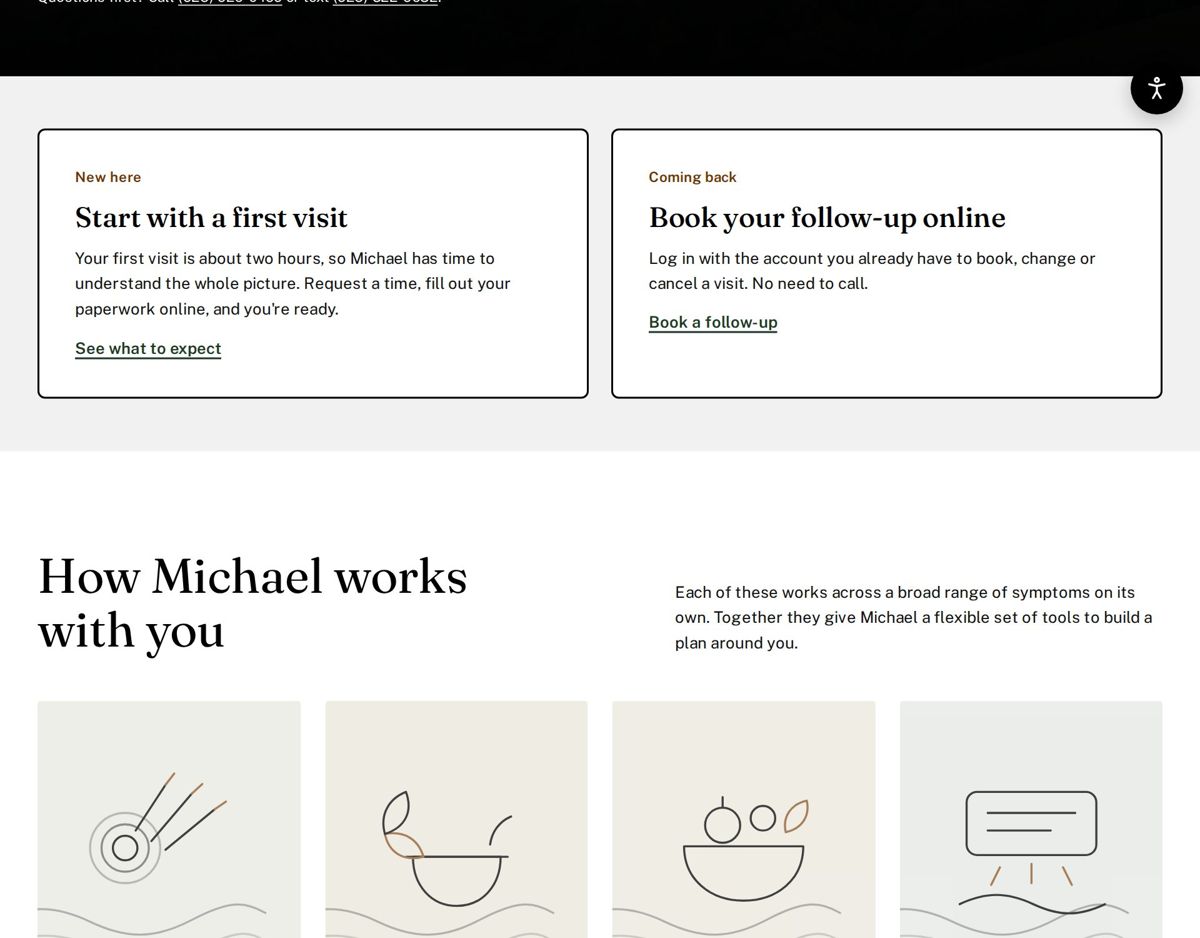
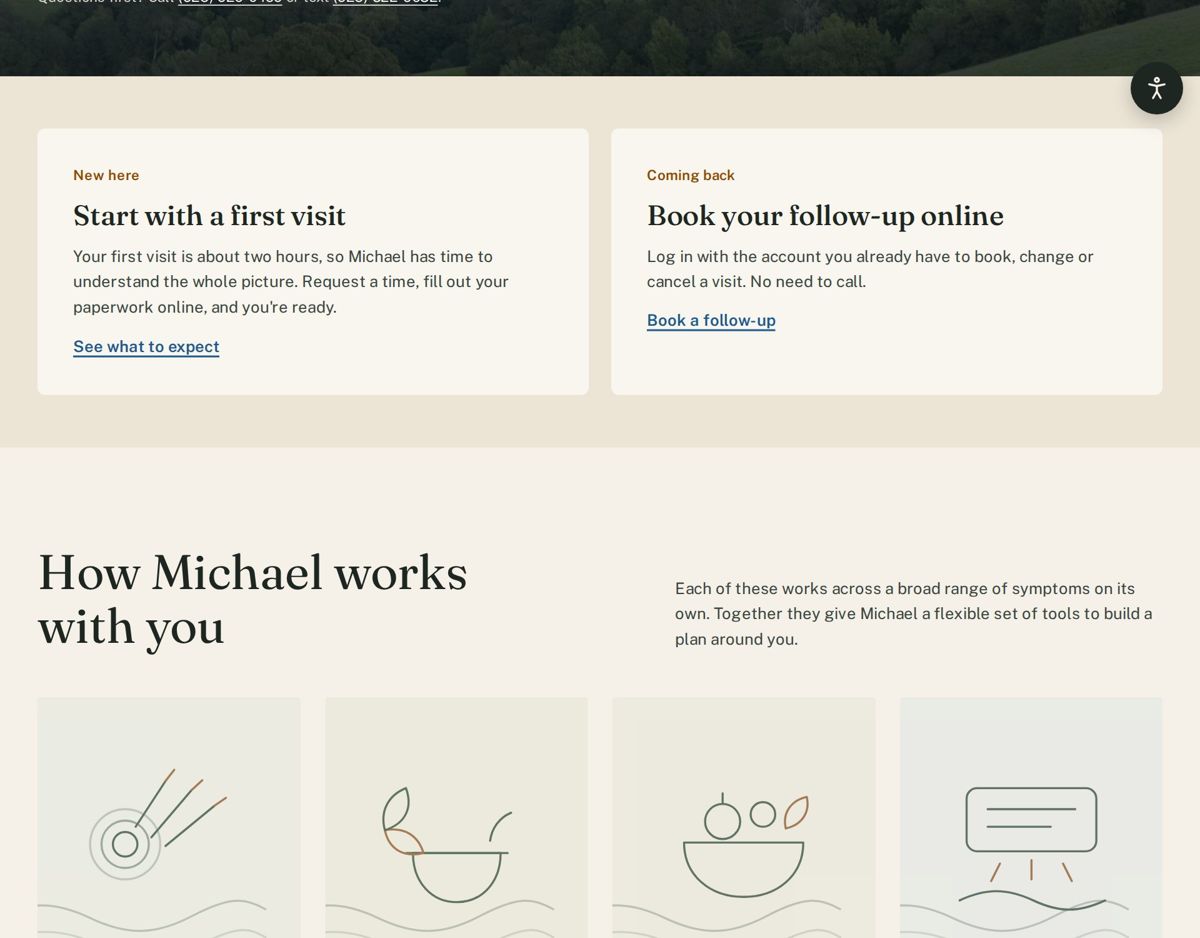
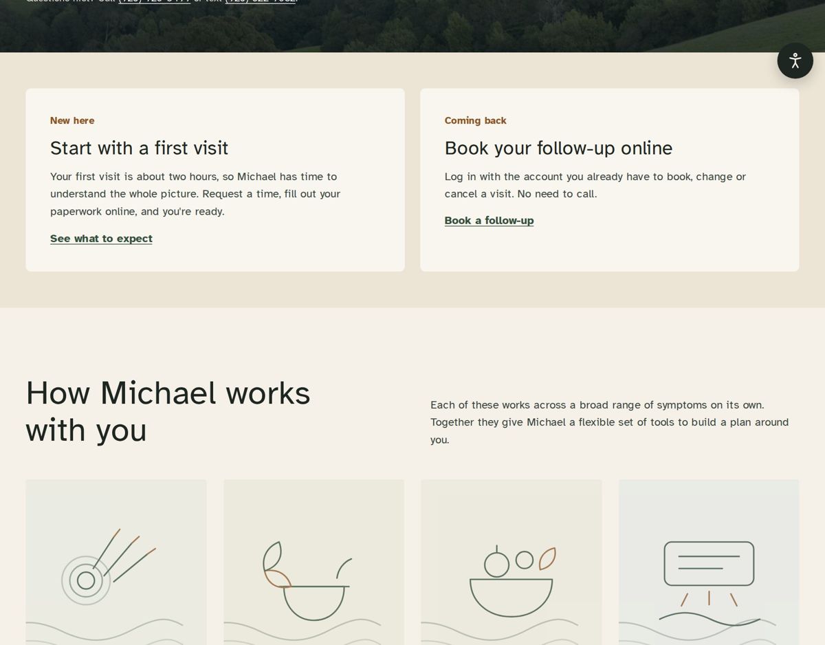
data-contrast="high"Swaps the palette for stronger contrast and gives cards a solid outline.data-cvd="on"Moves accents from green and brown to blue and orange, and adds patterns where color alone carried meaning.data-font="readable"Sets all type in Atkinson Hyperlegible, designed for readers with low vision.data-text="lg" | "xl"Scales the whole page, layout included, to 112% or 125%.data-links="underline"Underlines every link, not just the ones in body text.data-motion="reduce"Stops transitions, animation and smooth scrolling. The system setting is honored too.
Making the system legible to Claude
I build these sites with Claude, so the system has to be as clear to Claude as it is to me. Three files do that.
- A guide that Claude reads before it touches a page. It sets the rules in plain language: color only from tokens, text tokens chosen by the surface underneath, a visible edge on every control, and every component working under every setting. If no token fits, Claude has to propose one rather than invent a color.
- Token metadata that records each token's role and the contrast each pairing has to meet.
- An automated check that reads the live stylesheet and tests every required pairing in four modes: default, high contrast, color vision, and both together. It also flags hard-coded colors, tokens that are used but never defined, and any missing focus style, motion setting or accessibility setting. Claude runs it after every change, and it can check a new component on its own before that component goes into a page.
The first run on the Natural Medicine Center site found real drift. Thirty-one colors had been written straight into components, in places like the form fields, the video player, the photo hero, the treatment timeline and a switch. It also found that the borders on form fields reached only 2.2:1 against white, below the 3:1 a control's edge needs.
$ node check.mjs site.html

Contrast: 120/120 pairings pass across 4 modes
Hard-coded colors: 0 in components; 5 in mode overrides or gradients (reported, not failed)
Undefined tokens: 0

Structure:
  pass  Visible focus style on links and controls
  pass  data-motion="reduce" turns off transitions and animations
  pass  OS reduced-motion preference respected
  pass  All settings styled: data-contrast, data-cvd, data-font, data-text, data-links, data-motion

All checks pass.

$ node check.mjs site.html new-card.html
  FAIL  .promo { background: #fff }
  FAIL  .promo { color: #333 }
  FAIL  .promo { border: 1px solid #ddd }
  FAIL  .promo .btn { color: white }
  FAIL  --brand in new-card.html
5 issue(s) found.
What the check cannot do: it cannot judge text over a photograph, because that depends on the image, so the hero is still checked by eye in each mode. It does not judge layout, wording or taste either. Those still need a designer.
Where it goes next
The same approach is being scoped for a field data app used by beverage brands, where Claude Code builds the screens. There, the guide covers interaction patterns as well as tokens, so a new field agent can finish a survey without needing a support call.